The task was to develop a Black Week campaign concept using the company’s corporate identity guidelines, including their typography system, core color palette, and visual style.

Fashion brand Black Week's advertising campaign
This project was created as part of a design assessment for brand BROKE+SCHÖN.
The assignment consisted of three main deliverables:
Creative concept & visual direction
Landing page hero section for the online shop
A1 promotional poster for in-store communication
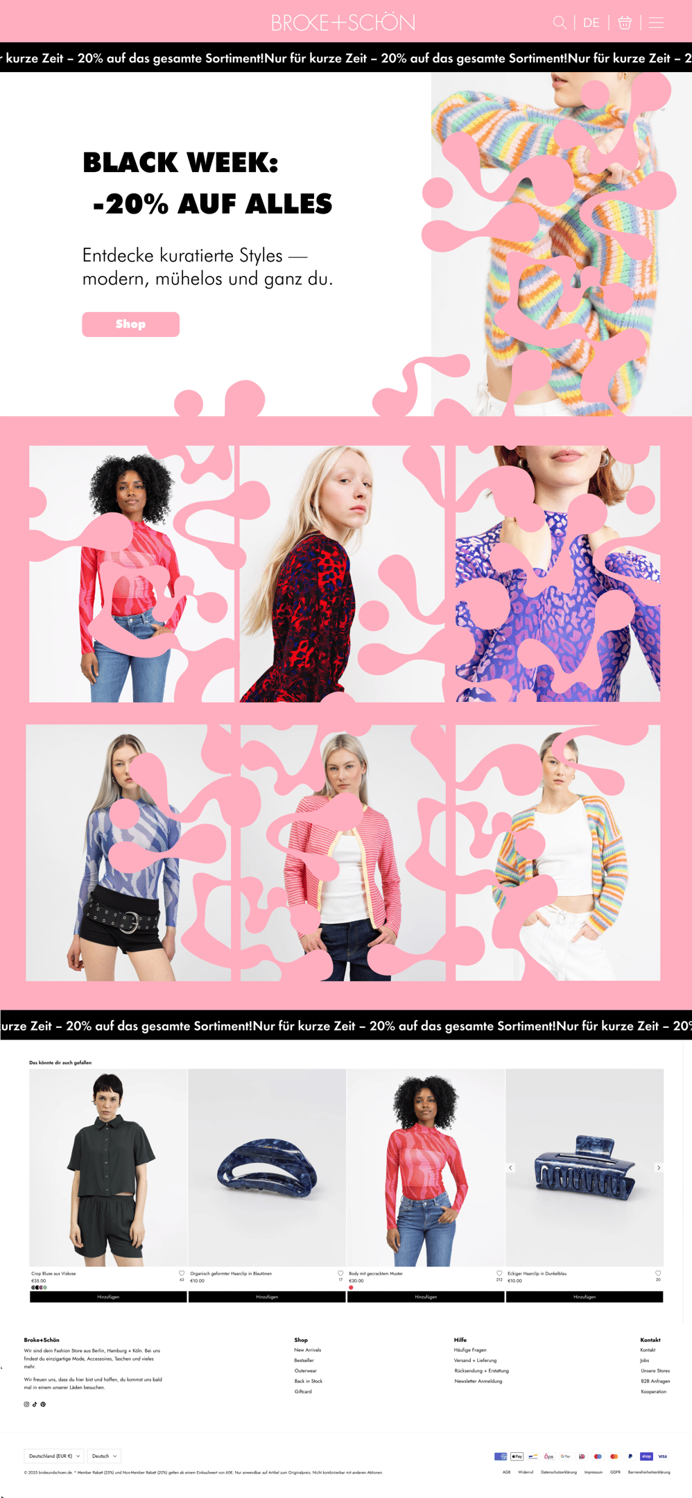
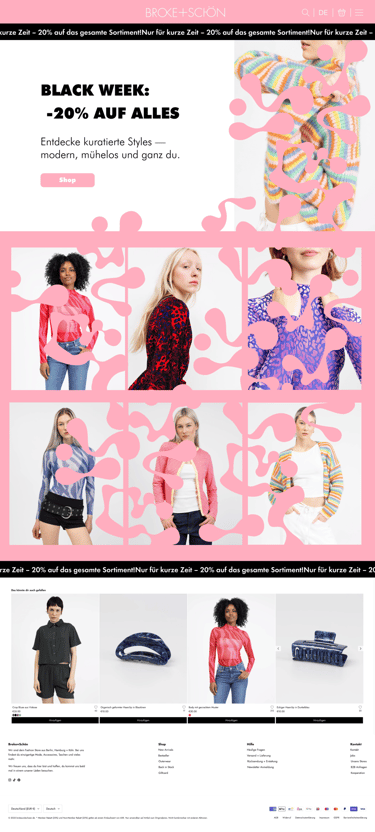
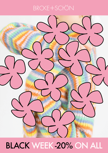
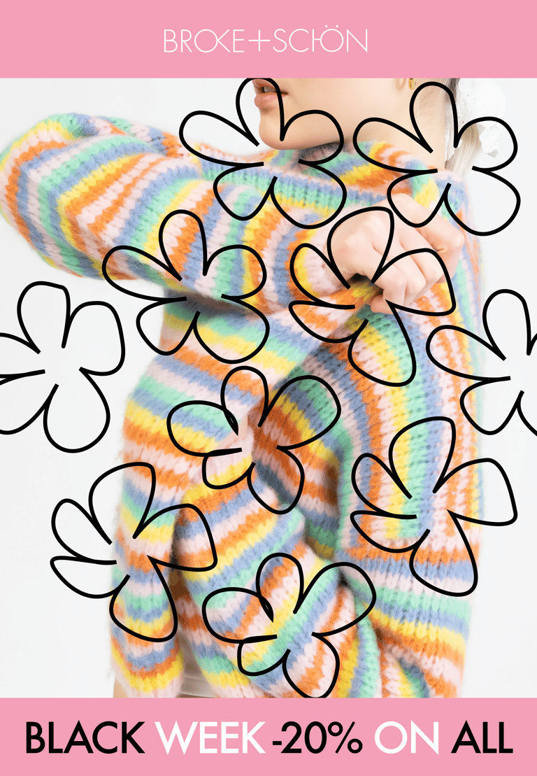
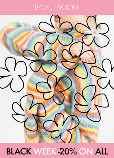
Landing page
Concept
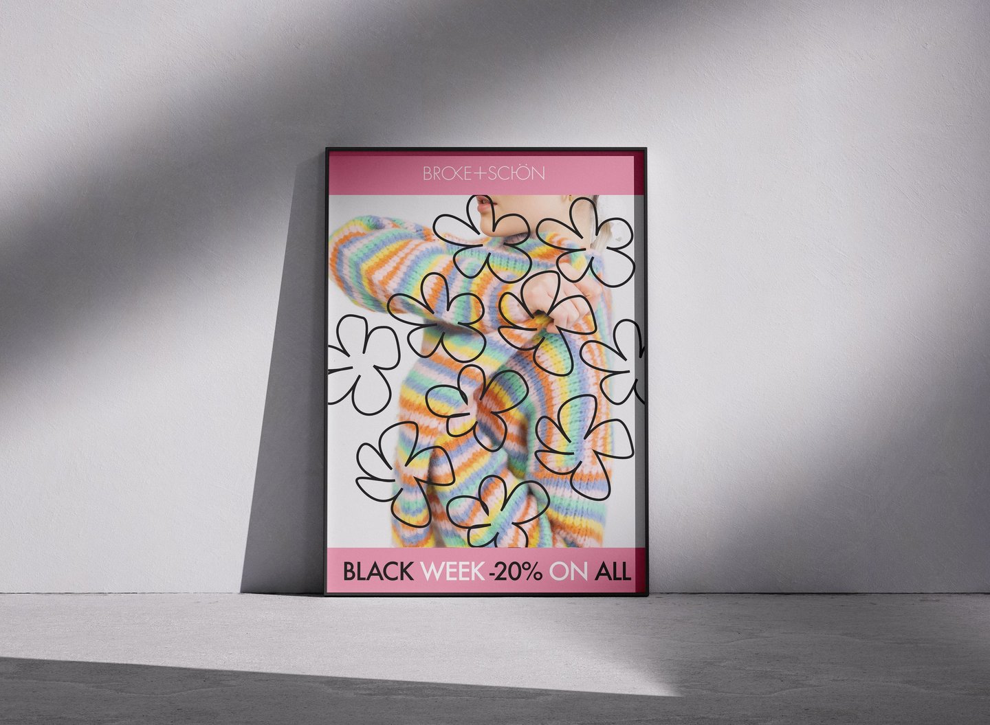
These fluid, blob-like shapes overlay the imagery to create:
a sense of movement and life
a connection to nature and softness
a contemporary, artsy feel
a visual identity that feels emotional rather than purely commercial
Tone & Message
To reflect the brand’s values of inclusivity and empowerment, the campaign carries energy: optimistic, confident, artistic, and effortlessly stylish.
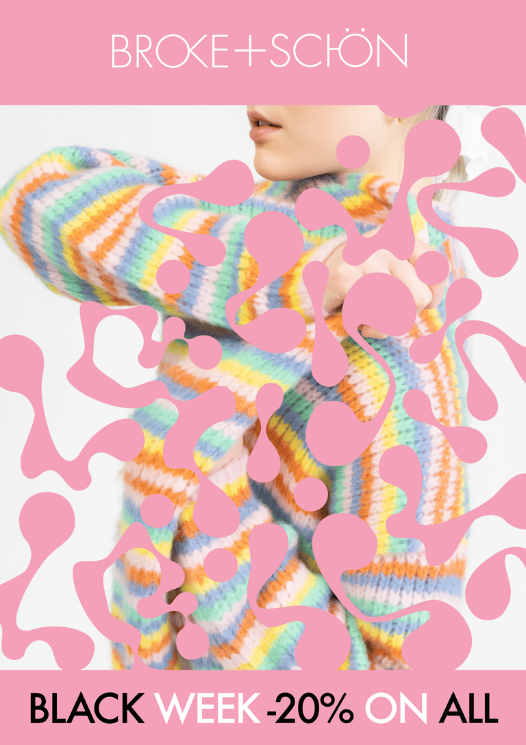
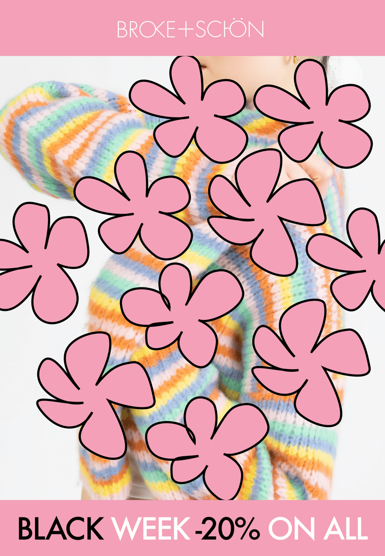
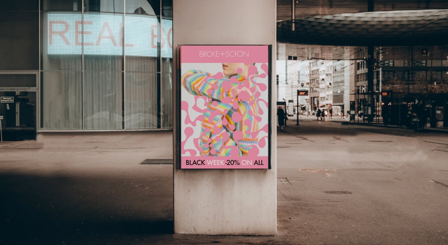
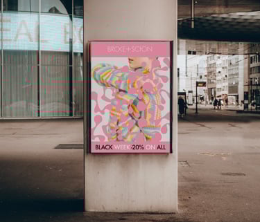
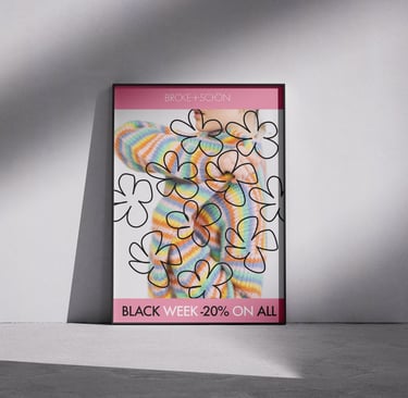
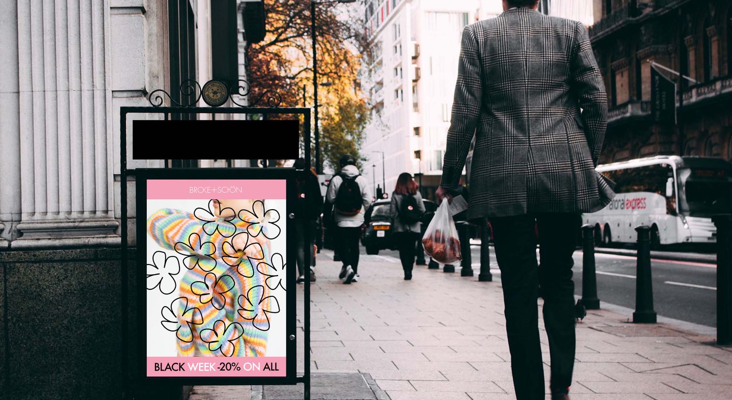
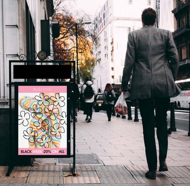
Poster
The close-up, cropped photography:
draws focus to texture and color
gives the poster a modern editorial feel
aligns with fashion retail aesthetics
reinforces the idea of individuality and self-expression
Blend of Copenhagen fashion energy, organic artistic forms, and Broke+Schön’s brand personality.
Inspired by movement, natural shapes, and the human connections behind fashion, the design expresses power, color, and confidence.
The result is a playful yet polished visual system that feels youthful, contemporary, and emotionally resonant with the brand’s identity.
Brand & Audience Insights
Through reviewing Broke+Schön’s website, social media presence, and team interviews, I identified a consistent brand tone: youthful, expressive, approachable, and confidently playful.
From a Design perspective, this meant choosing visuals that:
communicate the discount instantly
maintain the brand’s light, friendly personality
feel modern and emotionally engaging
stand out within the competitive Black Week environment
Visual Language
I used naturalistic shapes inspired by cells and atoms to create a sense of:
movement
individuality
energy
expressive softness
These organic forms work as a metaphor for personal style and inner vitality, while keeping the layout visually dynamic.